Sunday, 5 April 2015
Saturday, 4 April 2015
Friday, 20 March 2015
Thursday, 19 March 2015
Wednesday, 18 March 2015
Tuesday, 17 March 2015
Monday, 16 March 2015
Question Six contiuned
 |
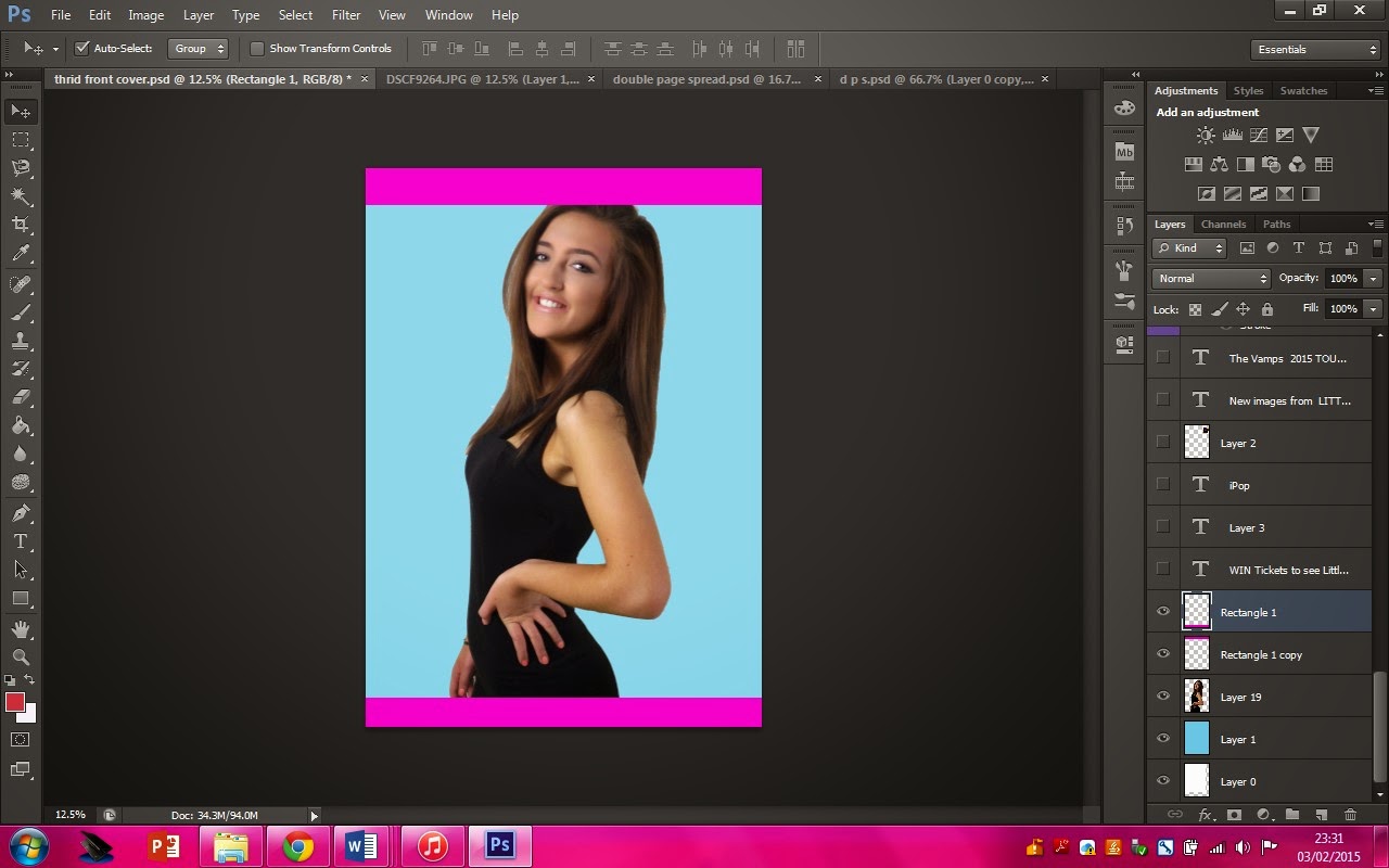
To start my front cover I created a rectangle to cover the
page which made a light blue using the fill tool
|


 |
Dragging this image on top of the rectangle was the next
step, I had I make sure it covered the full page and stayed in the middle.
|
 |
| I then used the two pink rectangles for my skyline and footer. |
 |
| I
added all the text using the text tool and I change the colour using the fill
tool. |
 |
I then added images
|
 |
| Here I have added a rectangle around the masthead, twitter, facebook, Instagram logos, barcoade, date, website, plug and price. |
Sunday, 15 March 2015
Question Seven
Looking back at your preliminary task, what do you feel you have learnt in the progression from it to the full product?


From creating my music magazine I have learnt lots of things such as:
- Pop magazine codes and conventions
- The main feature story should stand out from everything on the page
- That it is best to have three or four colours and for a pop magazine they should be bright and stand out
- To keep a house style
- How to make a Double Page Spread
- My skills on photoshop. I have developed my knowledge on how to do certain things and different shortcuts to do these things.
- Cutting the backgrounds out of images
- Adding borders
- Adding shapes
- Adding text
Front Cover:
- The Picture, I feel like if I got a picture of two students it would of made the front cover look more friendly.
- I would of changed the main feature story to something which gets the readers more involved.
- The colours, you can't see the blue, the green blends with the grass and the read isn't clear.
- I would of added a skyline, I looks like a poster
- I would of spread the feature stories out
- I would get rid of the circle around the plug.
- I would change the images and make sure they are images which feature on the front cover.
- I would change the layout completely as I think it doesn't look professional and it doesn't follow codes and conventions
- I would change the colours as it isn't very clear
- I would make sure all the images are the same size
In order to develop my music magazine I developed the understanding of what a pop magazine should look like here is what I found:
- The mast head will always stand out
- The main feature story must link to the main image
- The main image should be someone in a band or an artist who is popular and plays pop music
- Pop magazine are mainly aimed towards girls. I thought about this when choosing my colour scheme and my main image model
- The colours should be bright and stand out
Tuesday, 3 February 2015
Friday, 23 January 2015
Subscribe to:
Comments (Atom)


