
Sunday, 5 April 2015

Saturday, 4 April 2015


Friday, 20 March 2015


Thursday, 19 March 2015


Wednesday, 18 March 2015
Tuesday, 17 March 2015
Monday, 16 March 2015
Question Six contiuned
 |
To start my front cover I created a rectangle to cover the
page which made a light blue using the fill tool
|


 |
Dragging this image on top of the rectangle was the next
step, I had I make sure it covered the full page and stayed in the middle.
|
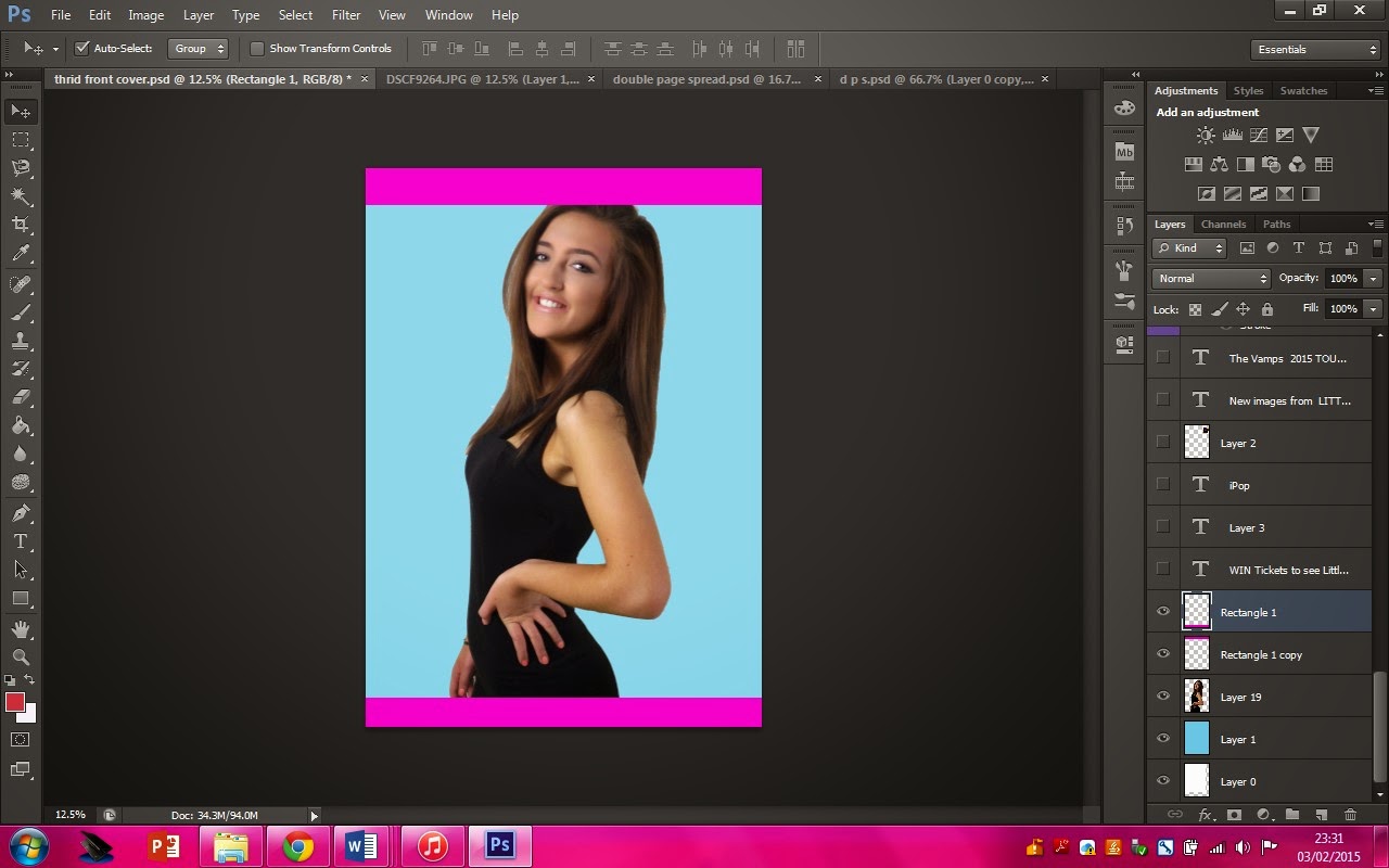 |
| I then used the two pink rectangles for my skyline and footer. |
 |
I
added all the text using the text tool and I change the colour using the fill
tool.   |
 |
I then added images
|
 |
| Here I have added a rectangle around the masthead, twitter, facebook, Instagram logos, barcoade, date, website, plug and price. |
 |
I have developed my front cover my changing the fronts,
moving things round to make it look more compact and I have added more images
from behind the scenes, which I have added a broader to make it more colourful.
This is my final Product.
|
Sunday, 15 March 2015
Question Seven
Looking back at your preliminary task, what do you feel you have learnt in the progression from it to the full product?


From creating my music magazine I have learnt lots of things such as:
- Pop magazine codes and conventions
- The main feature story should stand out from everything on the page
- That it is best to have three or four colours and for a pop magazine they should be bright and stand out
- To keep a house style
- How to make a Double Page Spread
- My skills on photoshop. I have developed my knowledge on how to do certain things and different shortcuts to do these things.
- Cutting the backgrounds out of images
- Adding borders
- Adding shapes
- Adding text
Front Cover:
- The Picture, I feel like if I got a picture of two students it would of made the front cover look more friendly.
- I would of changed the main feature story to something which gets the readers more involved.
- The colours, you can't see the blue, the green blends with the grass and the read isn't clear.
- I would of added a skyline, I looks like a poster
- I would of spread the feature stories out
- I would get rid of the circle around the plug.
- I would change the images and make sure they are images which feature on the front cover.
- I would change the layout completely as I think it doesn't look professional and it doesn't follow codes and conventions
- I would change the colours as it isn't very clear
- I would make sure all the images are the same size
In order to develop my music magazine I developed the understanding of what a pop magazine should look like here is what I found:
- The mast head will always stand out
- The main feature story must link to the main image
- The main image should be someone in a band or an artist who is popular and plays pop music
- Pop magazine are mainly aimed towards girls. I thought about this when choosing my colour scheme and my main image model
- The colours should be bright and stand out
Tuesday, 3 February 2015
Friday, 23 January 2015

Saturday, 13 December 2014
Front Cover Drafts


Friday, 12 December 2014
Second shoot
 |


First Shoot for front cover


I told my modal to stand like this because my original feature story was about her tour being candled because of a pregnancy however I changed this idea because of my target audience and I realised that young girls wouldn't want to know about celebrities being pregnant therefore it would be inappropriate. The lighting in this photo is also really bad.

I picked this dress because I thought it was elegant however I have decided it isn't bright enough there for when I do my shoot again I will change the outfit to something brighter.
Friday, 28 November 2014
Test shots
 |
| This a contact sheet of all of my test shots below you will see the best examples for the following shots. |
- Medium close up
- Close up
- Long shot
- Two shot
- Example of bad lighting
- Example of good lighting
- Example of a badly framed image
 |
| This image has an example of a badly framed image, to make the product look good the image should be central and now have half excess space and part of the models arm chopped off. |
 |
| This image is an example of a bad lighting; there is shadow in the background and the model looks washed out this is because the light is too close to her face. |
 |
| This image is a close up because all you can see is her head. This wouldn't look good on a magazine front cover because there would be the writing would cover her face taking the focus off the main artist. |
 |
| this is an example of good lighting the artist doesn't look washed out and there isn't much of a shadow. I think I could of improve this image by making sure there wasn't a shadow in them at all but this was the best example of good lighting in the images I have taken. |
 |
| This is a good example of a long shot. I like this image and would think about using a shot like this for my final images because it shows the artists costume off clearly also there is enough room to put stories around the edges and plugs, extra images ect. |
 |
| This is an example of good lighting there isn't much of a shadow and they artist's face looks really good. It isn't the best but it is the best out of my images. |
 |
| This is an example of a two shot. I could of framed it better and if I did frame it better this image certain shot would be good for my magazine. |
Wednesday, 19 November 2014
Focus group
Focus Group
Why is audience
research important?
Audience research is important because we find out what the
people who are buying the magazine want and helps me what content in my
magazine such as certain images and the way I use text. I also need to know
what style to make my magazine so it is key to my magazine.
How will it help when
creating my magazine?
This will make it easier to make my magazine and help I sell
easy.
My Questions
- Would you buy a pop magazine and why?
- What five artists come in mind when I say ‘pop music?’
- What price do you think is suitable for teenagers, 13 to 16?
- What things would make you look at the magazine and make you want to buy it?
- How often would you buy this type of magazine?
- Which name out of these ten would you choose and why?
- Which colour schemes do you think is the best for a pop magazine and why?
- Do you agree that students would be more likely to buy this magazine and why?
- Name two prices or competitions I could include which would be appeling for students
- Would you buy this magazine and why?
The focus group was very useful because it helped me choose
certain things to add to my magazine. It helped me decide what colour scheme to
use, how often the magazine will be published, how much it will be, what
celebrities top use, what prices to use and what target audience to aim for. I
didn't expect half the group to say they would buy it monthly I would buy a
magazine like this weekly. I generally found the group mainly said the same
thing for example they all agreed that it should be sold at about two pound
they also agreed that students would buy this type of magazine more than
adults. By doing this focus group and other research it has changed my mind
about my name of the magazine. I have decided to use a name with the word ‘pop’
in so POP, pop tunes, pop hits or iPop; I think I am going to use iPop as my
name on my magazine because gives a clear understanding of the genre also it
links with itunes which shows links the internet and modern technology because
of this I will show how you can access the magazine on line.
Wednesday, 12 November 2014
Subscribe to:
Posts (Atom)